Edgecomb Gray is one of the tones of the brand Benjamin Moore and due to its sleek and aesthetic look, it got famous quite instantly. Although it is a little darker, it still somehow gives a neutral and soft look to space. You can pair it with many colors as it provides a darker and gentle look simultaneously. Edgecomb gray complementary colors.
It can be stand out when paired with colors like pink, red, and with some lighter tones of blue as well, while other grey-toned paints only stand out with green, which makes it quite different and unique from others.
Edgecomb is a combination of softer, neutral and warmer characters. It has quite an organic look in it and a more delicate appearance as well.
Its foundation is also what makes it different from other grey-toned shades. It has a comparatively softer foundation, and due to which it gives a warmer look.
Although Edgecomb grey has a softer tone and appearance, sometimes you might find your pain looking more intense and robust,
which can be due to the following reasons
- Sometimes light makes it look more intense as it has a light reflective value of about 63, which makes it illuminating the room more in a brighter environment.
- Sometimes exposure to the sunlight makes it intense. In the afternoon, sunshine might increase its intensity.
- Even though Edgecomb gray pairs with red quite considerably, if you have tones of green in the space, that combination may increase its intensity.
- Sometimes having cream or yellow tones nearby can make it look intense because Edgecomb Gray has a relatively pink and off-white style. The combination does not stand out much and leaves the pain looking solid and passionate, which is sometimes not ideal and not what a customer wants.
The intensity of Edgecomb gray complementary colors
Edgecomb Gray is a kind of intense color. It has a warmer tone in it. But after you paint it, it depends on the intensity or the luminance of the light or position of the sunlight, whether it will give a warmer look or a more relaxed look.
Edgecomb Gray is a warm, gray, and sandy toned color, and it looks lovely on the wall. It is aesthetically remarkable, excellent, solid, and most importantly, stylish and increases the appeal and appearance of the space quite efficiently. It is neutral and soft also, which gives more of a calmer look. Edgecomb Gray is famous for its diverse nature of expression as a paint.
Colors go with Edgecomb gray complementary colors
Edgecomb Gray combines brown, off-white, and sandy gray tones; thus, you can pair it with various colors like different shades of white, brown, and some lighter shades of blue and red. They stand out and complement each other.
When paired with Edgecomb gray, another stunning color makes it look sleeker, which is revere pewter. It is a crisp gray tone, and they complement each other in literal terms when paired with each other. You can use the combination in your bedroom, drawing room, or even in the TV lounge as it is going to make the space look dominantly good.
Light Shades Of Edgecomb Gray:
Many lighter tones of Edgecomb gray are available, like a white dove and Chelsea gray, etc. The Edgecomb gray is a bit darker in tone. However, it provides quite a good luminance as its LRV is 63. Still, if someone wants to paint with lighter tones of this stunning color, then there are colors like a white dove, as mentioned. Its tones and shades give a creamy, sandy, and earthy look that makes the space look terrific.
You can pair Edgecomb gray with many different colors as well so that it can stand out more. Some of them are.
- Chelsea Gray.
- Ashley Gray.
- White Dove.
- Hale Navy.
- Revere Pewter.
- White Chocolate.
- Simply White.
All these, when paired with Edgecomb Gray, make it look even better.
Adding Edgecomb Gray to your Free Space:
Benjamin Moore has made such a fantastic color and gives it the name Edgecomb gray. Due to its unique look, it looks great in almost every space. It can be bright, sturdy, earthy, and aesthetic as well.
Entry Way:
Entrance is the one thing that impacts the whole place quite significantly, and using Edgecomb gray for it would be a great choice because of its coolness and colorful nature. It just adds charm to the entrance and making the guest feel more welcomed and invited. It does not make it look overwhelming but makes the whole place look just perfect.
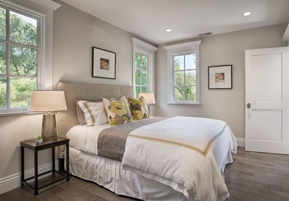
Edgecomb Gray in the Bedroom:
Suppose you are looking for a paint that would enhance the calm environment of your bedroom in addition to a simple and beautiful look. In that case, Edgecomb gray should be in your consideration because of its cool, artistic and earthy tone, and it just makes your room look gorgeous, bright, and relaxing.
Exterior:
You can use Edgecomb Gray in many places, and for sure, a house exterior is one of them. Due to its sleek and aesthetic look, it just complements your whole house structure and makes it look more lively and unique. Edgecomb Gray is a shade of gray color paint, but its thick and earthy look makes it look different and makes it stand out.
Edgecomb Gray Compared:
Even though Edgecomb gray has been setting high paints and colors, there are many different paints of the same character and durability.
Edgecomb Gray vs. SW Agreeable Gray:
No doubt, Benjamin Moore has one of the best quality paints, but many other brands compete in this race. When Benjamin Moore has the best colors like Edgecomb gray, there is another paint-giving competition from Sherwin Williams’s collection, and it is agreeable grey.
In comparison, both the colors are shades of gray, but Edgecomb gray is more close to earthy and sandy while agreeable gray is a bit closer to gray, and its reflective value is 60, which is also quite close to that of Edgecomb gray.
Edgecomb Gray vs. SW Accessible Beige:
When you look at the color chart of Benjamin Moore, it is impossible to like every color due to their uniqueness; similarly, Edgecomb gray is one of them. But Sherwin Williams also has a great collection as well, and accessible beige is one of them. They both are shades of gray tone color.
Edgecomb Gray is a dark gray tone with a bit of sandy reflection in it. On the other hand, SW accessible beige is a lot more brownish and earthy than edge comb gray, and it has an LRV of approx. 58, it usually is considered a light color, but it is darker than other lighter tones.
Edgecomb gray complementary colors vs. Revere Pewter:
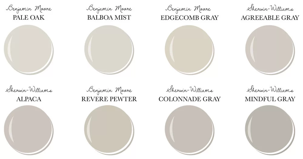
When it comes to paints, Benjamin Moore has one of the best shades to look for in your house, and Edgecomb gray and revere pewter are one of the best choices if you’re looking for a sleek, aesthetic creamy, and solid gray look.
But the question of choosing one to have the best-looking walls at home remains. To clear, the Edgecomb has a solid and thick look to it, while revere pewter has a crisp tone which makes it a bit darker and also makes it go well with shades like blue and red. Another thing that you can select the lightness of the revere pewter and reduce its darkness to almost 50%
You can also use Edgecomb gray and revere pewter together as a combination, as they both compliment each other quite well. They both tend to enhance each different shade, and the whole scene looks splendid. Using revere pewter with Edgecomb gray improves the gorgeous creamy gray tone of Edgecomb gray.
Edgecomb gray, as discussed previously, has an LRV of 63 and Revere Pewter has about 55.
Edgecomb gray complementary colors vs. Pale Oak:
Edgecomb Gray has many shades and tones, and pale oak is one of them. Most of the customers mentioned that they had found many difficulties while choosing which one to choose between, Edgecomb gray and pale oak, as they both exhibit quite good looks when it comes to wall painting
The significant differences between them are that pale oak has a warmer gray, and Edgecomb gray has a lighter tone. Edgecomb gray has an LRV of 63, while pale oak has a reflective value of 70, so if you are painting a room with lots of windows and lights.
You want it to be bright, you should go for the pale oak as it has a higher reflective character and will show more luminance, but if you are looking for a pain that won’t make a room that bright and also give a sleek and aesthetic look you should go for Edgecomb gray. As the trend for the warmer and solid gray shades increases, no doubt most of the customers will go for the pale oak because of its darker tone.
Edgecomb Gray vs. Balboa Mist
Both the Edgecomb Gray and Balboa mist are the top-rated paints. They both have many things in common, making them complicated options to choose from and use for the room or space.
Edgecomb gray has a reflective value of about 63, and balboa mist has an LRV of approx. 67 they are quite the same in their reflective characteristics. Although, the only visible difference between them is that Edgecomb gray has a bit sandy tone in it while balboa mist is a bit more towards the gray tone. But all the difference aside, they both are at the highest standards and are have very premium quality.
LRV Of Edgecomb Gray:
When we talk about paints, the LRV value is a must-considered thing in most of the scenarios. And it is the measure of how much a surface reflects the light to distribute the luminance throughout the room or space. The highest LRV value can be 100, meaning that it can hits back all the light is hitting on the surface. And the minimum value can be 0, which means that it will absorb all the light leaving the room dark.
Edgcomb Gray color lies in the ranking somewhere above the middle with the LRV value of 63, which allows it to be an excellent pain to eliminate room with the perfect brightness. Edgecomb Gray had been popular due to its color and luminance ability as it does not have a greenish tone.
It is also quite famous for its solidity because it sticks well with any wall surface. Due to its outstanding brilliance and adhesive nature, it is considered one of the top paint brands. It just complements the whole décor and design of the room by giving a great look to it, and due to its luminance, it just lights up every corner of the room.